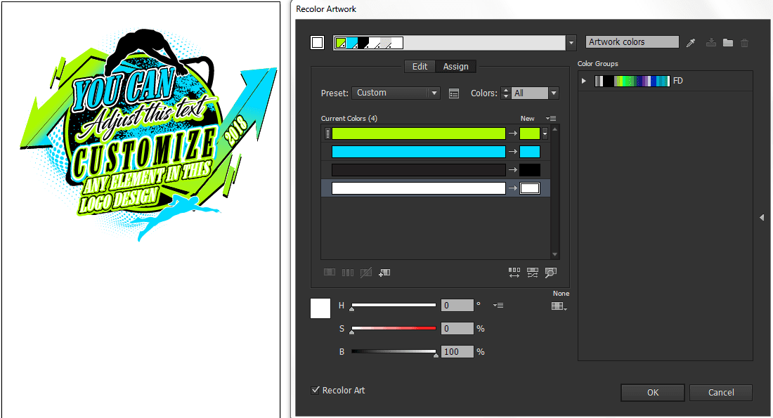
- When it comes to logo design in Adobe Illustrator, adjusting the color is a crucial step that can greatly impact the overall look and feel of the design. To ensure that the colors are accurate and visually appealing, there are some professional techniques to keep in mind. Firstly, it is important to understand the color modes available in Illustrator, such as CMYK for print and RGB for digital. Selecting the appropriate color mode ensures that the logo will display accurately in its intended medium. Additionally, utilizing the color picker tool in Illustrator allows for a precise selection of colors, while the color wheel can assist in creating harmonious color palettes. It is also advisable to experiment with different color combinations and variations to find the perfect balance. Lastly, regularly checking the logo design in different lighting conditions and devices can help ensure that the colors are consistent and visually appealing across various platforms. By following these professional steps, designers can confidently adjust the color for logo designs in Adobe Illustrator while creating impactful and visually captivating branding elements.
- Lastly, remember that consistency is key when it comes to logo design. Once you have selected the perfect color palette for your logo, make sure to apply it consistently throughout all your brand materials. This includes business cards, letterheads, website design, and any other marketing collaterals.
- In addition to color consistency, it is important to consider the psychology of colors in your logo design. Different colors evoke different emotions and can convey various messages to your audience. For example, blue is often associated with trust and reliability, while red can signify energy and passion. Understanding the impact of colors can help you create a logo that resonates with your target market.
- Furthermore, paying attention to color combinations is crucial. Some colors complement each other, while others clash and create visual discord. By experimenting with various color combinations, you can find the perfect balance that not only looks visually appealing but also conveys the right message for your brand.
- Lastly, keep in mind that colors can appear differently on different devices and mediums. It is essential to test your logo design across various platforms to ensure that the colors remain consistent and visually appealing. This will help you maintain a strong and cohesive brand identity.
- In conclusion, understanding the importance of color in logo design is crucial for creating a visually appealing and impactful logo. By utilizing professional techniques, such as selecting the appropriate color mode, using precise color selection tools, and experimenting with color combinations, you can create a logo that not only looks visually appealing but also effectively communicates your brand’s message to your target audience.
Moreover, typography plays a significant role in logo design. The choice of fonts and their arrangement can enhance the overall impact of the logo. When selecting fonts, it is important to consider the personality of your brand. Do you want to convey a sense of elegance and sophistication? Or maybe you aim for a fun and playful vibe? Different font styles and weights can help you achieve the desired tone.
In logo design, it is advisable to keep the number of fonts to a minimum to maintain visual consistency and clarity. Using more than two or three fonts can make the design appear cluttered and confusing. By selecting complementary fonts that work harmoniously together, you can create a cohesive and visually pleasing logo.
In addition to selecting the right fonts, pay attention to the arrangement and spacing of the typography. Proper kerning, leading, and tracking can make a significant difference in the legibility and overall balance of the logo. Adjusting the spacing between individual letters and words can ensure that the typography is well-proportioned and visually appealing.
Furthermore, consider the scalability of your logo design. A great logo should be flexible enough to be used across various sizes and applications without losing its impact and legibility. Test your logo design at different sizes, from large billboard displays to small social media avatars, to ensure that it remains clear and recognizable. This scalability will allow your logo to adapt to different marketing materials and platforms effortlessly.
Additionally, incorporating symbolism and visual metaphors into your logo design can add depth and meaning to your brand. Symbols can communicate messages and values that words alone may not capture. Take the time to research and explore relevant symbols or metaphors that align with your brand’s identity.
Lastly, keep in mind that the logo design process is iterative. Don’t be afraid to seek feedback and make adjustments along the way. Show your design to colleagues, clients, or potential customers and gather valuable insights. It is through this collaborative process that you can refine and finalize a logo design that truly reflects your brand’s essence.
In conclusion, creating a captivating and impactful logo in Adobe Illustrator goes beyond adjusting colors. It involves careful consideration of typography, symbolism, scalability, and continuous iteration. By employing professional techniques and taking into account the psychology of colors, you can craft a visually appealing logo that effectively communicates your brand’s message and resonates with your target audience. Remember, a well-designed logo is a powerful tool that can leave a lasting impression and contribute to the success of your brand.


