

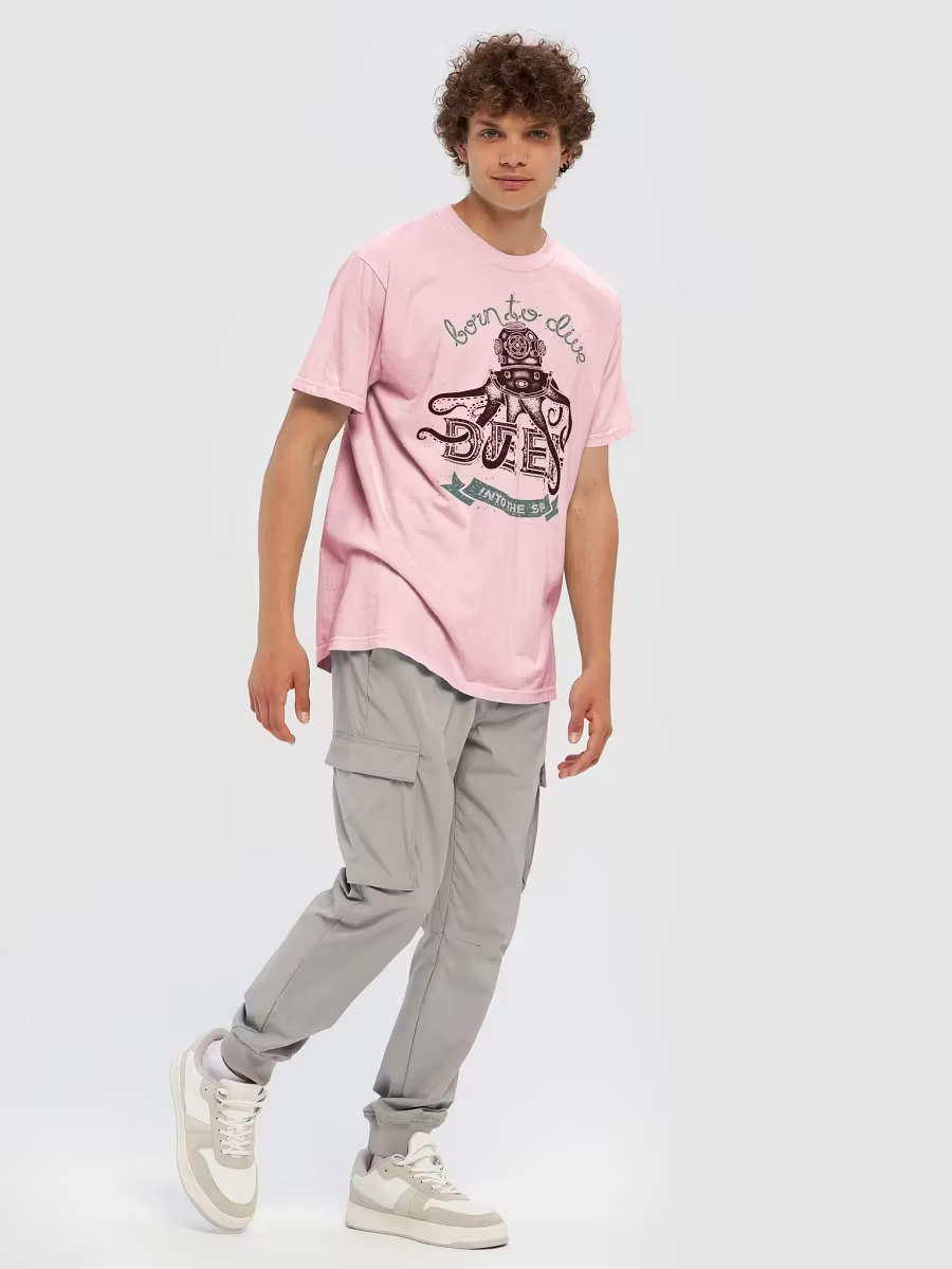
A sports tournament logo is no longer seen only on a T-shirt.
Today, the same event artwork may appear behind athletes during an awards ceremony, in team photographs, on livestream overlays, inside social-media posts, on digital scoreboards, in registration emails, on sponsor backdrops, and in highlight videos that remain online long after the competition ends.
That changes the way event artwork should be evaluated.
A logo can look impressive when viewed as a large isolated graphic and still perform poorly once it appears:
- behind an athlete
- in a crowded team photo
- in the corner of a livestream
- on a phone screen
- on an awards backdrop
- in a vertical social-media video
- inside a small event thumbnail
For tournament organizers, this creates an important question:
Will the event logo still work when people are looking at the athletes instead of the artwork?
At MyEventArtist, we create sports-event artwork for gymnastics meets, softball and baseball tournaments, volleyball events, wrestling invitationals, FEIS competitions, cross-country meets, track and field events, cheer and dance competitions, martial arts tournaments, swimming events, and many other sports.
If you are still selecting the main artwork for an upcoming event, our Print Ready Designs can provide a strong starting point. But once the artwork is chosen, it is worth thinking beyond apparel.
A modern tournament logo should be able to live in front of a camera.
Why Photography Changes the Way a Logo Is Seen
When participants see a tournament shirt in person, they may be only a few feet away.
A photograph changes that.
The shirt may occupy only a small portion of the image.
The athlete may be moving.
The lighting may be poor.
The photograph may later be compressed for social media.
The viewer may be looking at everything on a five-inch phone screen.
That means extremely fine details often disappear.
What survives?
Usually:
- large title
- strong silhouette
- major color contrast
- recognizable symbol
- year
This is why clear visual hierarchy matters so much.
Your Logo May Be Viewed at 10% of Its Original Size
Imagine a beautiful 12-inch back print.
Now imagine a team photograph with 20 athletes.
Each shirt design might appear only one inch wide on the viewer’s screen.
If the event title is already small inside the original artwork, it may become completely unreadable.
That does not mean the full design should be simplistic.
It means the most important elements need to remain strong enough to survive reduction.
A useful test is to make the artwork very small on your screen.
If all you see is a colorful blob, the hierarchy may need work.
Large Event Titles Photograph Better
A tournament title often needs to compete with:
- athlete uniforms
- equipment
- venue signage
- spectators
- banners
- sponsor logos
A strong title gives the artwork a visual anchor.
For example:
MASQUERADE
should generally remain easier to identify than:
small decorative pearls
tiny candles
background lace
Those details can still add richness.
But they should support the title rather than replace it.
Think About the Athlete Standing in Front of the Design
This is especially important for awards backdrops.
Suppose you create a beautiful eight-foot banner with the tournament logo centered.
Then an athlete stands directly in front of it.
Now the athlete covers:
- event title
- year
- mascot
- sponsor
The photo no longer clearly identifies the event.
A better backdrop may repeat the event mark in several positions.
That way, at least one remains visible around the athlete.
Step-and-Repeat Backdrops Work for a Reason
A step-and-repeat backdrop typically repeats:
event logo
sponsor logo
event logo
sponsor logo
across the entire surface.
This is useful because no single logo needs to remain completely unobstructed.
Even when:
- athlete stands center
- trophy covers lower area
- coach joins the photo
several event marks remain visible.
This is especially valuable because award photographs are often among the most shared images from a tournament.
Do Not Make the Repeated Logos Too Large
If the logos are huge, a photograph may show only:
half a logo
part of a sponsor
one giant letter
Smaller repeated marks often work better.
The goal is for one or more complete logos to appear around the subjects.
Always mock up the backdrop with an average-height person standing in front before printing.
Sponsor Backdrops Need an Event Identity Too
A sponsor wall should not look like random businesses happened to sponsor a photograph.
Include the tournament identity.
For example:
Event logo
alternating with:
sponsor logos
Now every photograph clearly belongs to the tournament.
This is more valuable for both the event and the sponsors.
Consider the Height of Children and Teen Athletes
This is easy to overlook.
A backdrop designed around adult eye level may behave differently when used for:
- youth gymnastics
- junior volleyball
- dance
- youth wrestling
If the event logo appears only at six feet high, it may float above the athlete’s head.
If it appears only near the bottom, the athlete may cover it completely.
Repeat logos vertically as well as horizontally.
Tournament Logos Need a Horizontal Version Too
Many main event designs are vertical because that shape works beautifully on a T-shirt.
Livestreams often need something completely different.
A video overlay may have a long narrow space.
For example:
MASQUERADE INVITATIONAL 2027
might need to sit along the bottom of a broadcast.
Trying to squeeze a tall vertical logo into that space can make it microscopic.
A horizontal variation can solve the problem.
What Is a Livestream Overlay?
A livestream overlay is a graphic placed on top of live video.
It may contain:
- event logo
- score
- athlete name
- division
- sponsor
- venue
- round
The event logo usually needs to remain small.
This means a simplified or horizontal version can be extremely useful.
Livestream Logos Need Strong Contrast
Video backgrounds constantly change.
One moment the camera shows:
bright floor
then:
dark audience
then:
athlete uniform
A logo without a strong border may disappear against one of those backgrounds.
A broadcast-friendly mark often benefits from:
- solid outline
- dark outer border
- white keyline
- contained badge
- strong shape
The artwork should remain visible regardless of what is happening behind it.
Do Not Use Fine Script for Tiny Broadcast Graphics
Elegant script can look beautiful in a large tournament logo.
At small broadcast size, thin script may become difficult to read.
You can keep script in the primary identity while using a simpler supporting version for video.
This is another reason an event can benefit from multiple related logo versions.
If your event wording changes regularly, our Adjustable Titles and Subtitles can help keep the main identity flexible, while our Adjustable Font Designs are useful for events that expect regular title updates.
Design a Small Corner Bug
In television and livestream terminology, a small persistent logo in the corner of the screen is sometimes called a bug.
For a tournament, this could be:
event initials
year
small icon
For example:
MI 27
with a masquerade mask.
Or:
SPD 27
with a shamrock-softball symbol.
This can remain visible during the entire stream without covering the action.
The Full Logo Does Not Belong Everywhere
This is one of the most important branding lessons.
Your primary logo may be perfect.
That does not mean it should be forced into:
- every video corner
- every medal
- every social avatar
- every shirt sleeve
- every scoreboard
A strong event identity can have:
full logo
horizontal logo
simplified mark
icon
All four can belong to the same tournament.
Social-Media Thumbnails Are Tiny
Before someone watches a tournament highlight video, they may first see a thumbnail.
That thumbnail may appear only a few centimeters wide.
Tiny details will not help.
A strong thumbnail might use:
large athlete
large event title
one strong symbol
high contrast
small logo
Do not try to fit the full event flyer inside a thumbnail.
YouTube and Facebook Video Covers Need Clear Headlines
For example:
2027 FINALS
will read much better than:
Welcome to the 2027 Annual XYZ Invitational Championship Final Competition
Keep the promotional headline short.
The event logo provides context.
The video title and description can contain the full information.
Vertical Video Changes Composition Again
TikTok, Instagram Reels, YouTube Shorts, and other vertical platforms use a tall 9:16 format.
A horizontal banner may not fit naturally.
This is another reason to separate:
event identity
from:
event layout.
The logo can remain consistent while the surrounding composition changes.
Keep Important Content Away From Interface Overlays
Vertical video platforms often place:
captions
buttons
usernames
comments
near the edges of the screen.
Do not put critical event information too close to:
bottom
right edge
top
Keep the important title and logo within a safer central area.
Tournament Photography Can Become Long-Term Marketing
A strong event photograph does not disappear when the event ends.
It can be reused for:
next year’s promotion
registration pages
sponsor proposals
social-media posts
website galleries
anniversary articles
This means event branding visible in the photograph has long-term value.
A recognizable logo in the background helps every photograph continue advertising the tournament later.
Create an Official Photo Area
If space allows, set up one place specifically for photographs.
It could include:
event backdrop
lighting
podium
trophies
decor
Now athletes and families naturally create branded content.
They take the photos for you.
Those images spread across social media.
The event identity travels with them.
The Best Photo Areas Feel Like Part of the Event Theme
Imagine a masquerade gymnastics meet.
Instead of only:
plain sponsor wall
the photo area could include:
black curtain
gold frame
subtle pearls
event logo
elegant lighting
Now the photography area becomes an experience.
The logo does not need to carry the entire theme by itself.
Do Not Overdecorate the Photo Area
There is a limit.
If the background contains:
large mask
huge balloons
five candelabras
giant sponsor logos
multiple athletes
decorative text
ornamental border
the actual athlete may disappear into the scene.
Remember:
The athlete is the hero of the photograph.
The branding is the supporting environment.
Use Negative Space Around Faces
Avoid placing important lettering directly behind where heads are likely to appear.
In group photographs, faces occupy a large central area.
Logo marks can be placed:
above
beside
between
below
rather than directly behind faces.
Awards Podiums Can Be Branded Too
A small event mark on the podium can appear in hundreds of photographs.
Because the podium is close to the athlete, the mark should be simple.
This is an excellent place for:
secondary logo
icon
year
rather than the full complex artwork.
Banners Need to Work in Photos From Across the Venue
A banner may physically measure six feet wide.
But in an action photograph, it may occupy only a small section of the background.
The event title should remain readable from a distance.
Avoid:
tiny sponsor lists
long paragraphs
complex details
on banners intended to appear in competition photography.
Design Entrance Banners Differently From Photo Backdrops
They perform different jobs.
An entrance banner can say:
WELCOME TO THE 2027 MASQUERADE INVITATIONAL
with:
location
date
host
A photo backdrop should generally contain less information.
Different applications need different visual priorities.
Digital Scoreboards Offer Another Branding Opportunity
Some venues allow custom scoreboard graphics.
These may appear:
before competition
between sessions
during awards
during breaks
A simplified event logo works extremely well here.
Again, high contrast matters.
The design may be viewed from hundreds of feet away.
Do Not Assume Your Computer Colors Match the Venue Screen
LED screens can make colors appear:
brighter
darker
more saturated
than they do on a monitor.
Very subtle dark colors may disappear.
Extremely bright neon colors may become overwhelming.
If possible, test graphics on the actual display system.
Use a Simple Opening Screen for Livestreams
Before the competition begins, a livestream can show:
event logo
event name
date
“Starting Soon”
This gives early viewers confirmation that they are watching the correct event.
A beautiful tournament logo can work very well here because it has the entire screen.
Create a Matching Break Screen
For example:
AWARDS BEGIN AT 4:30 PM
with:
event logo
sponsor
simple background
This looks much more professional than leaving a blank or frozen camera feed during breaks.
Create a Closing Screen
After the stream:
THANK YOU FOR JOINING US
event logo
host organization
next year’s date if available
This gives the broadcast a finished ending.
The Logo Can Become a Watermark for Highlight Videos
A very subtle event mark can appear in a corner throughout:
recap videos
athlete highlights
winner reels
This helps preserve event identity when clips are reposted elsewhere.
Keep it small enough that it does not distract from the sport.
Think About Reposting
A team may download your video.
An athlete may screen-record it.
A parent may repost it without the original caption.
If the event identity is already visible in the image, the content still carries its source.
That is another reason subtle on-screen branding can be useful.
Photography Should Influence Shirt Design Too
Consider what happens in team photos.
If the event shirt contains:
tiny event title
huge illustration
the design may look attractive in person but fail to identify the tournament in photographs.
Try to preserve at least one clearly readable event phrase.
This is especially important for annual tournaments where future photos may be difficult to identify.
The Year Matters in Historical Photos
Ten years later, someone may find a photograph.
Without the year, they may struggle to remember:
2026?
2027?
2028?
Including the year on:
shirts
backdrops
banners
awards
helps turn event photos into historical records.
Build a Media Version of the Logo
A useful tournament logo package can include:
Primary Logo
Detailed main artwork.
Simplified Logo
Small applications.
Horizontal Logo
Livestreams and banners.
Icon
Profile images and watermarks.
White Version
Dark backgrounds.
Dark Version
Light backgrounds.
This makes media production much easier.
Transparent PNG Files Are Especially Useful for Media
While vector artwork is ideal for editing and large production, transparent PNG files are convenient for:
video overlays
social posts
photo graphics
presentations
A transparent background allows the logo to sit cleanly over imagery.
Keep the vector master too.
Make Sure Transparent Files Actually Have Transparency
A common mistake is exporting a logo with a white rectangle behind it.
Then a video editor places it over footage and the white box appears.
Always verify the file on:
dark background
and:
light background.
White Logo Versions Are Extremely Useful
A white or light logo can work beautifully over:
dark photography
night video
black backgrounds
This is especially useful for elegant events or cinematic highlight reels.
A white mark often feels much cleaner than trying to place the full multicolor artwork everywhere.
One-Color Marks Can Look More Premium on Video
A full-color logo can sometimes feel busy over moving footage.
A simplified:
white
gold
black
version may appear more sophisticated.
This is particularly useful for:
gymnastics
dance
figure skating
premium invitational events
where the visual atmosphere is important.
Sport-Specific Artwork Can Improve Highlight Graphics
A wrestling event might use:
wrestler silhouette
A volleyball event:
ball and net motif
A gymnastics event:
apparatus or gymnast pose
If you create supporting promotional graphics yourself, MyEventArtist’s Free Sports Figure Vectors can provide useful building blocks.
Our Free Vector Mascots can also help when school or team identity needs to appear in supporting media.
Background Graphics Can Keep Posts Consistent
You do not always need the full tournament illustration.
A subtle themed background can help social posts feel connected.
For example:
ice texture
lace pattern
stadium silhouette
halftone sports background
Our Free Vector Logo Backgrounds can be useful for creating supporting graphics around an existing event identity.
Titles Can Be Reused Across Media
A strong event-title treatment can appear:
on shirts
video openings
social posts
registration graphics
If you are assembling your own layouts, Free Sports Event Title Vectors can also provide inspiration or building blocks.
Consistency in title styling helps connect all of the event’s visual media.
Keep Sponsor Logos Out of Critical Video Areas
Livestreams may include:
scores
timer
athlete names
Do not place sponsor graphics where those elements appear.
Plan the overlay system before broadcast day.
For example:
top left — event logo
top right — sponsor
bottom — score
A simple layout avoids visual competition.
Sponsor Recognition Can Rotate
A livestream does not necessarily need six sponsor logos on screen at all times.
Instead:
Sponsor A appears during one break.
Sponsor B appears during another.
Presenting sponsor remains in a smaller permanent position.
This can look cleaner while still providing valuable sponsor exposure.
Create Sponsor Slides
During breaks, display:
sponsor logo
short thank-you
event identity
This gives each sponsor much more visibility than placing all logos together at tiny sizes.
Social Media Can Extend Sponsor Value
After the event, photographs from the branded backdrop may continue to circulate.
That means sponsors can continue receiving exposure after the competition ends.
This makes good event photography part of the sponsorship package.
Tell Sponsors Where Their Logos Will Appear
A sponsor agreement might include:
T-shirt
backdrop
livestream
website
social-media feature
This is much clearer than simply promising:
“Event exposure.”
Better planning leads to better design.
Create Templates Before Event Day
Do not wait until:
finals
awards
championship announcement
to figure out the graphic style.
Prepare templates in advance for:
Champion
Runner-Up
Finalist
Personal Best
Team Award
Now event staff only need to add:
photo
name
result
The identity remains consistent.
Winner Graphics Should Be Easy to Share
Athletes and teams love recognition.
A clean graphic containing:
photo
CHAMPION
event logo
division
can spread quickly.
Every repost becomes additional promotion for the event.
Keep Athlete Names Larger Than Decorative Text
For winner posts, the athlete or team should be the star.
Avoid burying names inside overly decorative artwork.
Clear hierarchy:
CHAMPION
Athlete Name
Division
Event Logo
works well.
Photography Can Help Sell Next Year’s Event
Imagine next year’s registration page.
Instead of only:
“Register now.”
you can show:
packed venue
smiling medalists
team photographs
branded backdrop
competition action
Those images make the event feel real.
Good branding makes them instantly recognizable.
Your Best Marketing Asset May Be This Year’s Participants
Professional advertising is useful.
But an athlete posting:
trophy photo
event shirt
team picture
to their own social network can be extremely powerful.
That content feels genuine.
A strong tournament identity makes sure the event receives recognition in those posts.
Make Your Photo Area Easy to Find
If you invest in a branded backdrop, do not hide it in a corner.
Place it near:
awards
registration
main entrance
merchandise
Encourage participants to use it.
A beautiful backdrop has little value if nobody knows it exists.
Consider a Social-Media Sign
A small sign can include:
event hashtag
Instagram account
Facebook page
This encourages people to tag the event.
Keep the information simple.
Choose One Main Event Hashtag
Do not give participants five different hashtags.
Choose one recognizable option.
For example:
#MasqueradeInvitational2027
or a shorter branded variation.
Consistency makes event content easier to find.
Test the Hashtag Before Announcing It
Search the platform.
Make sure the hashtag is not already heavily associated with:
unrelated event
brand
controversial topic
A specific year can help distinguish it.
Encourage User-Generated Content
You can post:
Show us your team photo.
Tag us in your event shirts.
Share your awards pictures.
People enjoy being included.
Reposting selected participant content can make the event social feed feel much more alive.
Ask Permission When Appropriate
Especially when working with children or youth sports, event organizers should follow their own photography policies and applicable permissions.
Branding should never override participant privacy expectations.
Make sure the event’s media practices are clear.
A Great Event Logo Should Survive Both Motion and Stillness
On a shirt, the logo is still.
On a livestream, the background moves.
On a photo backdrop, people cover parts of it.
On social media, it becomes tiny.
On video, it may appear for only two seconds.
A strong tournament identity adapts to all of those situations.
That is why professional event branding is increasingly about more than producing one large illustration.
What If Your Existing Design Is Too Detailed for Media?
Do not automatically replace it.
You may simply need:
simplified version
horizontal version
icon
one-color version
If you have already purchased a MyEventArtist design and later discover that you need additional adaptations for social media, video, awards, alternate merchandise, or another application, visit Customize Print Ready Design.
Often the full identity is already there.
It simply needs another format.
What If the Title Needs to Change for Media?
Perhaps your shirt says:
30th Annual Pilgrim Harvest Invitational 2027
but the livestream overlay only has room for:
Pilgrim Harvest 2027
That is another situation where flexible typography becomes useful.
Our Adjustable Titles and Subtitles can help when event wording needs to be adapted while preserving the overall visual direction.
For designs intended from the start to offer more editable wording, browse our Adjustable Font Designs.
When a Custom Design Is Better
Some events know from the beginning that the identity will appear on:
shirts
livestream
social media
awards
sponsor wall
medals
banners
In those situations, it can be useful to design the main identity with those applications in mind from day one.
A Custom Design Request can allow the artwork to be developed around:
specific theme
venue
sport
colors
media needs
merchandise plan
instead of adapting an unrelated design later.
Print-Ready Does Not Mean Print-Only
This is an important point.
A strong vector event design can become much more than apparel artwork.
It can provide:
colors
symbols
typography
visual personality
for the entire event.
You can begin with one of our Print Ready Designs and then build a wider visual system around the elements that make it recognizable.
Before Finalizing Your Tournament Logo, Try the Camera Test
Place the design in these situations:
Shirt Mockup
Can you read it?
Small Social Thumbnail
Can you recognize it?
Livestream Corner
Does it remain visible?
Backdrop Mockup
Does an athlete cover the important text?
Team Photo
Can you identify the event?
Vertical Reel
Does it fit naturally?
If the design passes all six, you have something far more versatile than a single shirt graphic.
Think About Where the Logo Will Be Seen Five Years From Now
An event photograph may outlive:
registration website
schedule
flyer
email campaign
A parent may still have the picture.
An athlete may still have the shirt.
The team may repost an old championship photo.
That is where consistent branding becomes historical.
The logo helps answer:
What event was this?
What year?
Where were we?
That has real value.
Tournament Branding Lives Inside Memories
A great event logo does not need to dominate every image.
It simply needs to be present enough that the memory has a visual signature.
The athlete should remain the focus.
The competition should remain the focus.
The celebration should remain the focus.
Good branding supports those moments.
It does not compete with them.
That is what makes event design work beyond the screen and beyond the shirt.
It becomes part of:
photos
video
awards
social posts
highlight reels
family memories
And years later, someone can look at one photograph and immediately know:
That was our tournament.
Explore our Print Ready Designs if you need a strong starting point for an upcoming sports event, or browse the MyEventArtist Blog for additional ideas about tournament branding, apparel, promotion, and event design.
Need flexible event wording? Visit Adjustable Titles and Subtitles or explore Adjustable Font Designs.
Already purchased artwork and now need a social-media, video, small-format, color, or layout adaptation? Visit Customize Print Ready Design.
For custom artwork developed around the entire event—from shirts to cameras—start with a Custom Design Request.
MYEVENTARTIST Team
#TournamentBranding #SportsPhotography #LivestreamGraphics #EventLogoDesign #SportsEventMarketing #MyEventArtist
Leave a Reply