Tip 2: Fine-tuning colors: Learn techniques to precisely adjust hues, saturation, and brightness to create the perfect color scheme for your brand or event.
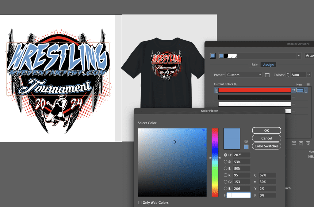
Fine-tuning colors is a crucial aspect of creating a visually appealing and impactful color scheme for your brand or event. When done correctly, it can significantly enhance the overall aesthetic and communicate your desired message effectively. Here are some helpful techniques to help you achieve the perfect color scheme:
- Understand color theory: Familiarize yourself with the basics of color theory, which involves studying the relationships between different colors and how they interact with each other. This understanding will guide you in making informed decisions when adjusting hues, saturation, and brightness.
- Adjusting hues: Hues refer to the actual colors on the spectrum, such as red, blue, or yellow. Use color adjustment tools available in graphic design software or photo editing applications to precisely fine-tune the hues. Experiment with different color combinations to find the ones that best represent your brand or event’s desired mood or identity. For example, warm hues like red and orange can evoke energy and excitement, while cool hues like blue and green convey calmness and serenity.
- Controlling saturation: Saturation refers to the intensity or vividness of a color. By adjusting the saturation, you can make colors appear more vibrant or subdued. Increase saturation for a bold, eye-catching effect, or decrease it for a more muted and subtle appearance. Be mindful of the emotions associated with different saturation levels, as highly saturated colors tend to evoke strong emotions, while desaturated colors create a more calming ambiance.
- Managing brightness: Brightness, also known as value or lightness, determines how light or dark a color appears. By adjusting brightness, you can create a sense of contrast and hierarchy within your color scheme. Brighter colors draw attention, while darker shades can convey sophistication or elegance. Experiment with different shades to achieve the desired balance and ensure readability and visual harmony.
- Consistency is key: Once you’ve established a color scheme, maintain consistency across all brand or event materials. Use the same adjusted hues, saturation levels, and brightness values to ensure a cohesive and unified visual identity. Consistency strengthens brand recognition and creates a sense of professionalism.
- Test across different mediums: Colors can appear differently on various devices and materials, such as screens, prints, or fabrics. Always test your color scheme across different mediums to ensure it translates well and remains visually appealing in different contexts. This step helps avoid any unexpected color variations and ensures your brand or event maintains its intended impact.
By mastering techniques to fine-tune colors, you can create a visually captivating and harmonious color scheme that effectively represents your brand or event’s essence and resonates with your audience.