The world of sports is not just about the adrenaline rush, the victories, or the defeats. It’s also about branding, identity, and the visual elements that represent a team or an athlete. One of the most crucial visual elements is the logo, and at the heart of many memorable logos is typography. Let’s dive into the world of typography styles in sports logo designs.
The Power of Typography in Sports Logos
Every sports fan can instantly recognize their favorite team’s logo. It’s not just an emblem; it’s an identity, a symbol of pride, and a beacon for supporters. While the design, color, and graphics play a significant role, typography often sets the tone and communicates the team’s ethos.
Why Typography Matters
Distinct Identity: Just as in business, sports teams need a unique identity. Typography ensures that the team’s name stands out and is instantly recognizable.
Evokes Emotion: The right font can evoke feelings of excitement, nostalgia, aggression, or elegance. For instance, a sleek, modern font might be perfect for a futuristic esports team, while a classic, bold typeface might suit a century-old football club.
Professionalism: A well-chosen font communicates professionalism and shows that the team means business both on and off the field.

Exploring Different Typography Styles
Serif Fonts: These are classic fonts with small lines or strokes attached to letters. They convey tradition, respect, and reliability. Examples from our competitors include teams with a long-standing history.
Sans Serif Fonts: Without any lines or strokes attached, these fonts are modern, clean, and straightforward. They’re commonly used for teams that want a contemporary, forward-looking image.
Slab Serif Fonts: These are blocky, bold fonts that command attention. Perfect for teams that want to make a statement.
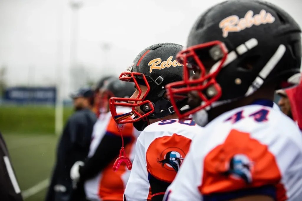
Script Fonts: Elegant and flowing, script fonts are often used for teams that want to convey tradition, elegance, or a touch of vintage.
Custom Fonts: Some teams go the extra mile by creating a custom font tailored to their brand. This ensures uniqueness and sets them apart from the competition.
Learning from the Best
When designing a sports logo, it’s essential to draw inspiration from various sources. Our analysis of competitor sites showed several teams and brands that have effectively used typography in their logos. While it’s crucial to have a unique identity, understanding what works in the industry can provide a solid foundation.
Getting Your Sports Logo Design
If you’re inspired and ready to get a unique and impactful sports logo design, look no further than My Event Artist. Our team of professionals understands the nuances of typography and can craft a logo that resonates with your team’s spirit and ethos.
Final Thoughts
Typography is more than just letters; it’s an art form that can elevate a sports logo from good to iconic. Whether you’re starting a new team or rebranding an existing one, consider the power of typography. Remember, the right font can capture the spirit, history, and aspirations of a team, creating a lasting bond with fans.
FAQs-Frequently Asked Questions
What font is used for sports logos?
There isn’t a single font used for sports logos. Designers often choose bold, dynamic, and easily readable fonts. Popular choices include fonts like Futura, Helvetica, and custom typefaces tailored for the specific team or event.
What is typography in logo design?
Typography in logo design refers to the art and technique of arranging type to make the text legible, readable, and visually appealing. It encompasses font choice, size, spacing, and layout.
How is typography used in logos?
Typography is used in logos to convey a brand’s message, establish its identity, and ensure its name is easily recognizable. The choice of typeface, style, and arrangement can evoke specific emotions and perceptions about the brand.


Leave a Reply