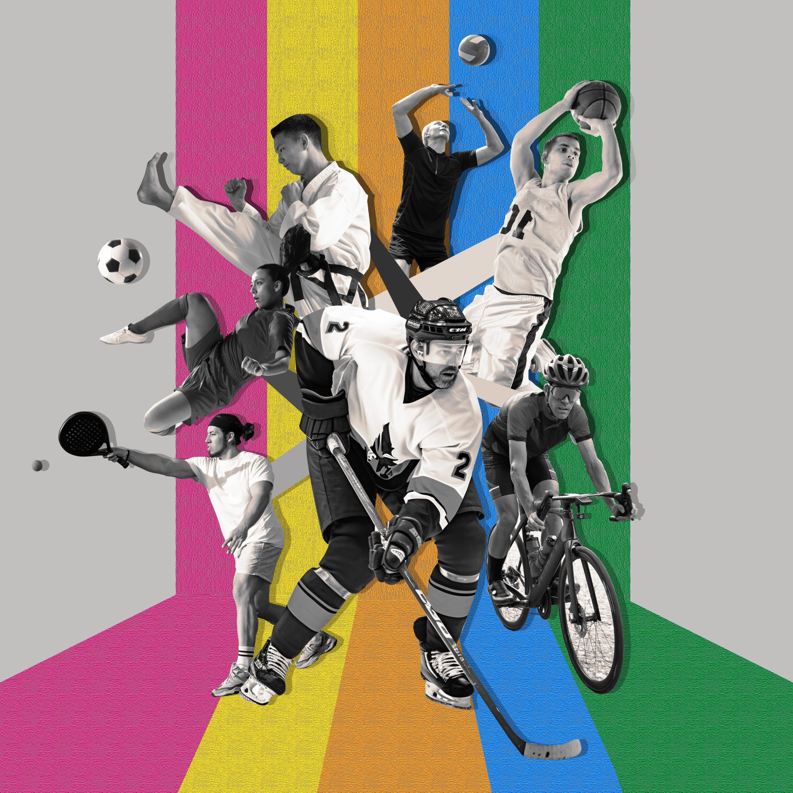
In the world of sports branding, a logo serves as the face of the event, team, or organization, invoking emotions and creating connections with fans. A well-executed sports logo not only captures the essence of the sport but also utilizes design techniques that elevate its impact. One of the most powerful yet often overlooked techniques in logo design is negative space. This blog post explores the significance of negative space in sports logo design, along with practical steps on how to effectively utilize it in Adobe Illustrator, ensuring that your logo is not only aesthetically pleasing but also profoundly memorable.
Understanding Negative Space in Logo Design
What is Negative Space?
Negative space refers to the area around and between the primary subjects of an image. In logo design, it can create shapes or convey messages that are not immediately obvious but significantly enhance the overall visual storytelling of the logo. When used effectively, negative space can transform a simple design into something clever and engaging.
Importance of Negative Space in Sports Logos
1.
Crafting Dual Meanings
Negative space allows designers to incorporate dual imagery within a logo. For example, the famous logo for FedEx cleverly uses the negative space between the “E” and “x” to create an arrow, suggesting speed and precision—a fitting representation for a delivery service. Similarly, in sports logos, integrating elements related to movement or action can enhance the perception of dynamism and energy.
2.
Simplicity and Minimalism
Sports logos need to be easily recognizable and memorable. By utilizing negative space, designers can create clean, minimalistic designs that are versatile across various media, from uniforms and merchandise to digital platforms. Simplified logos often translate better and maintain clarity, even when scaled down.
3.
Creating Visual Interest
When executed correctly, negative space adds layers of intrigue to a design. It invites viewers to engage with the logo more deeply, often leading them to discover hidden meanings or shapes. This engagement can enhance brand loyalty as fans feel a stronger connection to the logo and, by extension, the team or event it represents.
Iconic Examples of Negative Space in Sports Logos
- Pittsburgh Penguins: The penguin logo cleverly incorporates negative space to form a triangle, representing both a mountain and the ice rink, while also hinting at the team’s geographic location.
- Chicago Fire FC: This logo utilizes negative space to form a flame within a larger stylized emblem, effectively linking the team’s identity with the concept of heat and passion associated with their fanbase.
- Dallas Mavericks: The logo features a negative space silhouette of a horse’s head, subtly representing the team’s identity while maintaining clarity and simplicity.
How to Use Negative Space in Illustrator
Now that we understand the importance of negative space, let’s explore practical steps on how to integrate this concept into your sports logo designs using Adobe Illustrator.
Step 1:
Define Your Logo Concept
Before diving into design, outline your logo’s central theme and components. Consider the elements you want to incorporate, such as:
- Symbols of the Sport: Bats, balls, or gear are common symbols in many sports.
- Team Animal Mascots: Incorporating a mascot can personalize the logo.
Sketch your ideas on paper to visualize how negative space can be utilized creatively to combine different concepts.
Step 2:
Create Basic Shapes
- Open Illustrator and create a new document.
- Begin by using the Shape Tools (Rectangle, Ellipse, Polygon) to create the foundational shapes of your logo. Start simple—consider the primary elements and how they can be arranged.
Step 3:
Incorporate Negative Space
To effectively use negative space:
- Layer Shapes: Use overlapping shapes to create areas of negative space. For example, a circle can be layered over another shape to reveal negative space that can define a new shape.
- Use the Pathfinder Tool: This tool allows you to combine and subtract shapes. Use the Pathfinder panel (Window > Pathfinder) to merge or cut shapes, revealing negative space that becomes part of your design.
Step 4:
Refine Your Design
- Zoom In: Focus on the negatives and positives in your design. Look for opportunities to enhance the logo through additional negative space elements.
- Experiment with Different Styles: Vary your shapes and experiment with different arrangements to see how they interact with the negative space. Sometimes a slight rearrangement can reveal a hidden image or meaning.
Step 5:
Incorporate Color and Typography
- Choose Your Colors: Select a color palette that resonates with the brand and adds warmth or vibrancy while ensuring that the negative space remains impactful. Use one or two primary colors maximum to maintain simplicity.
- Typography: Select a font that complements the logo’s style. Ensure the font is legible and harmonizes with the design. Adjust the size and positioning to create a balance between text and negative space.
Step 6:
Test Versatility
Logos must function across various platforms and sizes. Test your logo:
- Scale It Up and Down: Ensure it retains clarity and remains recognizable in different sizes.
- Use Various Backgrounds: Test the logo on light and dark backgrounds to see how it interacts with colors and whether negative space is still pronounced.
Conclusion: Elevate Your Sports Logo Design with Negative Space
Negative space is a powerful design tool that can take your sports logo from ordinary to extraordinary. By leveraging negative space, logos gain depth, intrigue, and memorability—all vital characteristics in a competitive sports environment.
Incorporating this technique into Adobe Illustrator enhances your ability to make sharp, professional designs that resonate with audiences. As sports organizations aim to establish a strong brand identity, understanding how to use negative space effectively can lead to creating a logo that not only stands out but encapsulates the spirit of the sport.
At My Event Artist, we strive to help event organizers and apparel businesses stand out with exceptional logo designs that are both distinctive and compelling. Visit MyEventArtist.com to explore our extensive range of print-ready vector logos, customizable fonts, and more. If you’re looking for custom event logo designs tailored to your specific vision, don’t hesitate to reach out. Let us help you impact your sporting event with a logo that captures the essence of your brand!
Keywords: negative space, sports logo design, Illustrator tutorial, branding, graphic design, visual identity
#negativespace, #sportslogodesign, #Illustratortutorial, #branding, #graphicdesign, #visualidentity
Leave a Reply