
Designing a logo for the 7th Annual Grizzly Shakedown Wrestling Tournament was both an exhilarating creative endeavor and a meaningful representation of the event’s deep-rooted spirit. Our team at MyEventArtist sought to capture the energy, strength, and camaraderie that defines this beloved wrestling tournament through a dynamic and engaging logo design.
Conceptualization and Inspiration
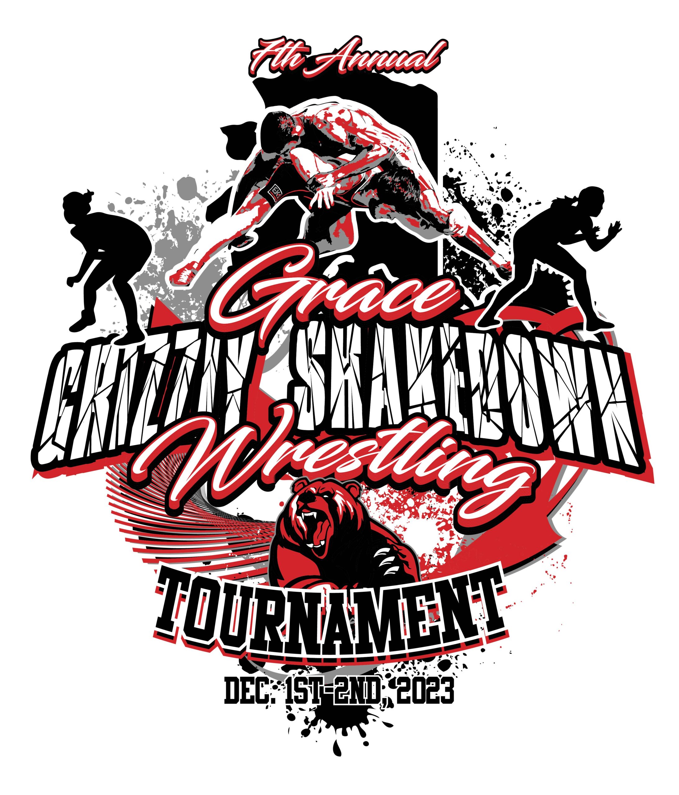
The Grizzly Shakedown is more than just a competition; it represents tradition, resilience, and the raw determination of young athletes. To encapsulate these themes, we focused on the powerful imagery of a grizzly bear—a symbol of strength and tenacity. The bear, in wrestling culture, embodies the fighting spirit and the ruggedness required to excel in this sport.
Our brainstorming sessions delved into not just how to visualize the bear, but how to render it in a way that resonates with the community. We envisioned a bear poised in a wrestling stance, demonstrating readiness and a fierce determination to succeed. The true challenge came from balancing the traditional aspects of wrestling with a modern design that could stand out in today’s visual landscape.
Design Process
Using Adobe Illustrator, the design journey commenced with detailed sketches of the grizzly bear. We aimed to portray not just a static image but a vibrant representation of action and motion. Our process evolved through several stages—from initial rough sketches that explored different poses to polished digital versions that included rich detailing.
The color palette was a crucial part of our design strategy. We selected earthy tones like deep browns and greens, reflecting the natural habitat of the grizzly bear, while incorporating bold accents of orange and gold to echo the tournament’s competitive spirit. This color combination was chosen to evoke emotions of strength, enthusiasm, and community pride.
Additional elements, such as stylized typography, were integrated into the logo to enhance readability and appeal. The words “Grizzly Shakedown” were crafted with a strong, muscular font that complements the bear’s fierce demeanor, ensuring clarity whether on a t-shirt or a massive banner.
Importance of a Strong Logo in Event Branding
The logo we created for the 7th Annual Grizzly Shakedown Wrestling Tournament transcends mere aesthetics; it is a vital tool for event branding. A well-designed logo fosters a sense of belonging and identity among participants, parents, and spectators. It promotes unity and pride within the wrestling community, serving as a rallying symbol that connects athletes and fans alike.
As experience shows, a strong visual identity significantly enhances marketing opportunities, making it easier to promote the event through various channels, including merchandise, posters, and social media platforms. The logo becomes an emblem that participants carry with them long after the tournament is over.
Final Thoughts
In essence, the logo for the 7th Annual Grizzly Shakedown Wrestling Tournament embodies much more than just a wrestling event. It symbolizes the strength, resilience, and unity of young athletes dedicated to their sport. This project highlights our commitment to helping events create distinct and memorable identities through impactful visual design.
Are you looking to bring your event to life with a custom logo? At MyEventArtist, we offer a variety of design services to meet your needs. Our website features layered vector designs that are easily adjustable if you’re familiar with Adobe Illustrator, along with live fonts and custom text options.
Explore our services today:
- Print Ready Designs
- Adjustable Titles and Subtitles
- Adjustable Font Designs
- Custom Design Requests
- Adjustments for Purchased Designs
- Customize Print Ready Design
Let’s get started on crafting something exceptional for your next event!
#WrestlingDesign, #EventLogo, #GrizzlyShakedown, #GraphicDesign, #SportsBranding, #CreativeProcess, #WrestlingCommunity
WrestlingDesign, EventLogo, GrizzlyShakedown, GraphicDesign, SportsBranding, CreativeProcess
Leave a Reply