The I-40 Baseball Showdown is set to be an electrifying event, uniting teams from all over to showcase their skills and passion for the game. Our design team at MyEventArtist has taken on the challenge of creating a logo that embodies the fierce competition and camaraderie inherent in baseball. With each element meticulously crafted, this logo will serve as a proud symbol for players and fans alike.
Inspiration and Conceptualization
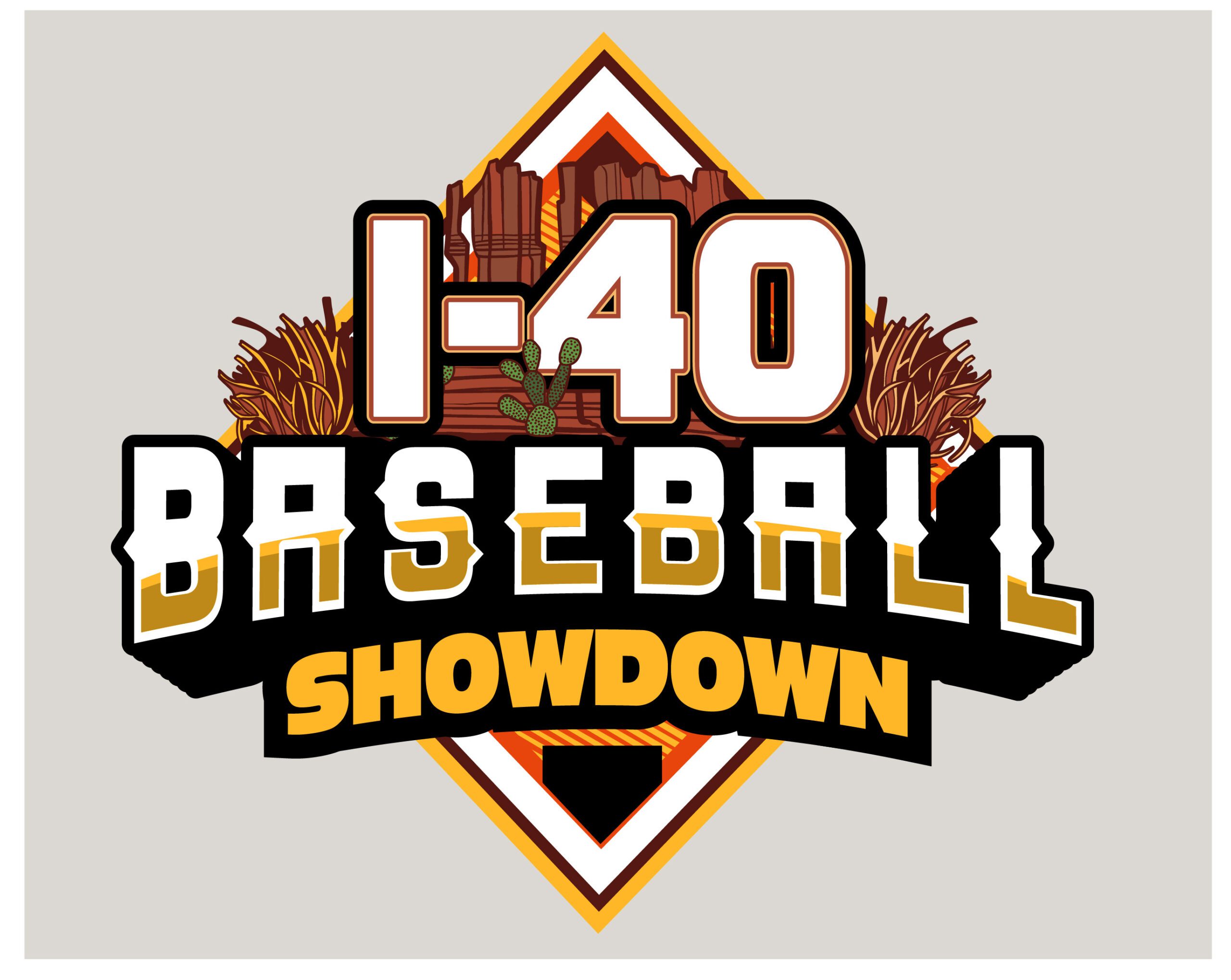
In crafting the logo for the I-40 Baseball Showdown, we drew inspiration from the vibrant energy of baseball games, the spirit of rivalry, and the iconic landmarks along Interstate 40. The logo aims to evoke feelings of nostalgia while capturing the excitement of competitive baseball.
Imagery such as baseball bats, balls, and a stylized home plate will be combined with elements that speak to the adventure of traveling along I-40, symbolizing teams coming together from various locales. The concept is designed to resonate with both players and spectators, creating a visual narrative that connects the event to its geographical roots.
The Design Process
- Brainstorming Sessions: Our journey began with collaborative brainstorming sessions where we explored different concepts and themes. We focused on vibrant symbols of baseball, integrating elements that represent community and competition.
- Digital Rendering: After establishing a direction, we moved to Adobe Illustrator to develop digital versions of our sketches. The aim was to create a powerful visual representation that stands out, whether it’s on team uniforms or event banners.
- Color Palette and Typography: The chosen color palette reflects the lively spirit of the game, with bold reds and blues that convey energy and excitement. A strong, dynamic font was selected to enhance the visual impact, capturing the essence of the I-40 Showdown.
The Role of a Strong Logo in Event Identity
The logo is not merely a design; it serves as the cornerstone of the event’s branding. A well-crafted logo instills pride among participants and fans, connecting them to the I-40 Baseball Showdown experience. It’s an emblem that fosters unity, embodies the competitive spirit, and enhances marketing outreach, making it a key asset for promotional campaigns.
Final Thoughts
In conclusion, the logo for the I-40 Baseball Showdown encapsulates the excitement and unity of the baseball community. It serves as a potent symbol of competition, bringing together athletes from diverse backgrounds under one common goal: to compete and celebrate the game.
For those looking to create unique branding for their sports events, our services at MyEventArtist are here to help. We specialize in custom logo designs that resonate with your audience and enhance your event’s identity.
Explore our offerings today:
Ready to hit a home run with your event branding? Let’s work together!
#BaseballDesign, #I40Showdown, #SportsLogo, #EventBranding, #GraphicDesign, #CommunitySpirit
Keywords: I-40 Baseball Showdown, Sports Branding, Logo Design, Community, Competition, Graphic Design
Leave a Reply