Design tips for versatility across light, dark, and variable surfaces.
Introduction: The Need for Versatile Logo Design
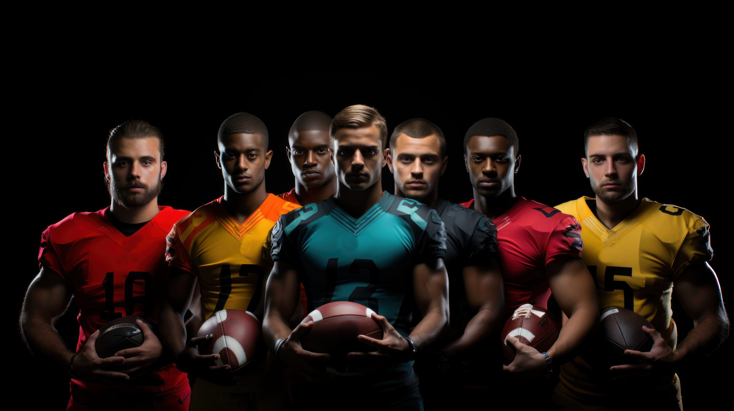
In the fast-paced world of sports event branding, your logo isn’t just appearing in one place—it’s everywhere. From digital banners and t-shirts to medals, stickers, and social media overlays, your logo must look sharp and recognizable on any background it encounters. A truly effective sports event logo is one that retains its impact whether showcased on a white jersey, a dark stadium screen, a patterned wall, or a sponsor’s website. Here’s how to ensure your logo is always up to the task.
1. Start With Simplicity and Strong Contrast
A simple, bold logo is not only more memorable but also more adaptable. When designing your mark, focus on clean shapes, defined lines, and clear icons. Avoid intricate details that can get lost against busy or highly textured backgrounds.
Key Tip:
Design your logo in black and white first. If it works without color, it’ll be easier to adapt it to any environment.
2. Create Multiple Logo Versions
Prepare multiple logo variations—including full color, black, white, and perhaps a single-color accent version—for different applications. This ensures your logo stands out whether it’s overlaid on a dark gym wall or a light promotional tee.
Commonly Used Versions:
- Full Color: For print, digital, and primary branding.
- White (“Knockout”) Version: For dark or busy backgrounds.
- Black/Monochrome Version: For use on light backgrounds or minimal designs.
3. Use Outlines or Background Shapes for Separation
If your logo includes both dark and light details, provide it with an outline or a simple solid shape (like a badge or circle) behind the logo. This technique gives the logo its own “canvas,” preventing it from visually blending into variable or photographic backgrounds.
Example:
A logo with white and gold elements might use a navy circle or shield for contrast when placed over variable imagery.
4. Choose Colors Strategically
Select core brand colors that hold up against multiple backgrounds. Strong mid-tones (think navy, red, green) often offer more adaptability than extremely light or pale hues. Avoid relying solely on gradients or transparency effects, which can disappear or look muddy on certain backgrounds.
5. Test Your Logo on Realistic Applications
Before finalizing your logo, test it across Real-World Scenarios:
- Over photography (crowds, stadiums, action shots)
- On event merchandise (light/dark shirts, hats, water bottles)
- As a small social icon or app button
- Over colored backgrounds and partner logos
Make adjustments as needed to ensure clarity and legibility in every setting.
6. Maintain Adequate Clear Space
Always define a “safe zone” or buffer around your logo—free from text, graphics, or edges. This helps it stand out, especially when placed alongside other elements or on visually busy backgrounds.
7. Equip Your Team With a Style Guide
Provide detailed logo usage guidelines for volunteers, sponsors, and vendors. Include each approved version, dos and don’ts, size minimums, and clear examples. This ensures consistent, professional application wherever your brand appears.
Conclusion: Versatility Equals Visibility
A versatile logo isn’t just a design luxury—it’s a necessity for sports events operating across platforms and media. By planning for adaptability from the start, you ensure your sports event brand is always bold, clear, and instantly recognizable, no matter where it shows up.
Want a logo built for any background?
Explore versatile, event-ready designs and custom packages at https://myeventartist.com/shop/.
Keywords: sports logo versatility, logo background adaptability, adaptable event branding, multi-background logo tips
#sportsbranding #logodesigntips #eventlogos #brandadaptability #myeventartist
Leave a Reply