Designing a logo for the Red Ryder Rumble Softball Event was an exciting creative challenge, fueled by the energy and competitive spirit of the game. Our team at MyEventArtist aimed to craft a design that would reflect the dynamic atmosphere of the event while highlighting the camaraderie and passion of softball enthusiasts.
Conceptualization and Inspiration
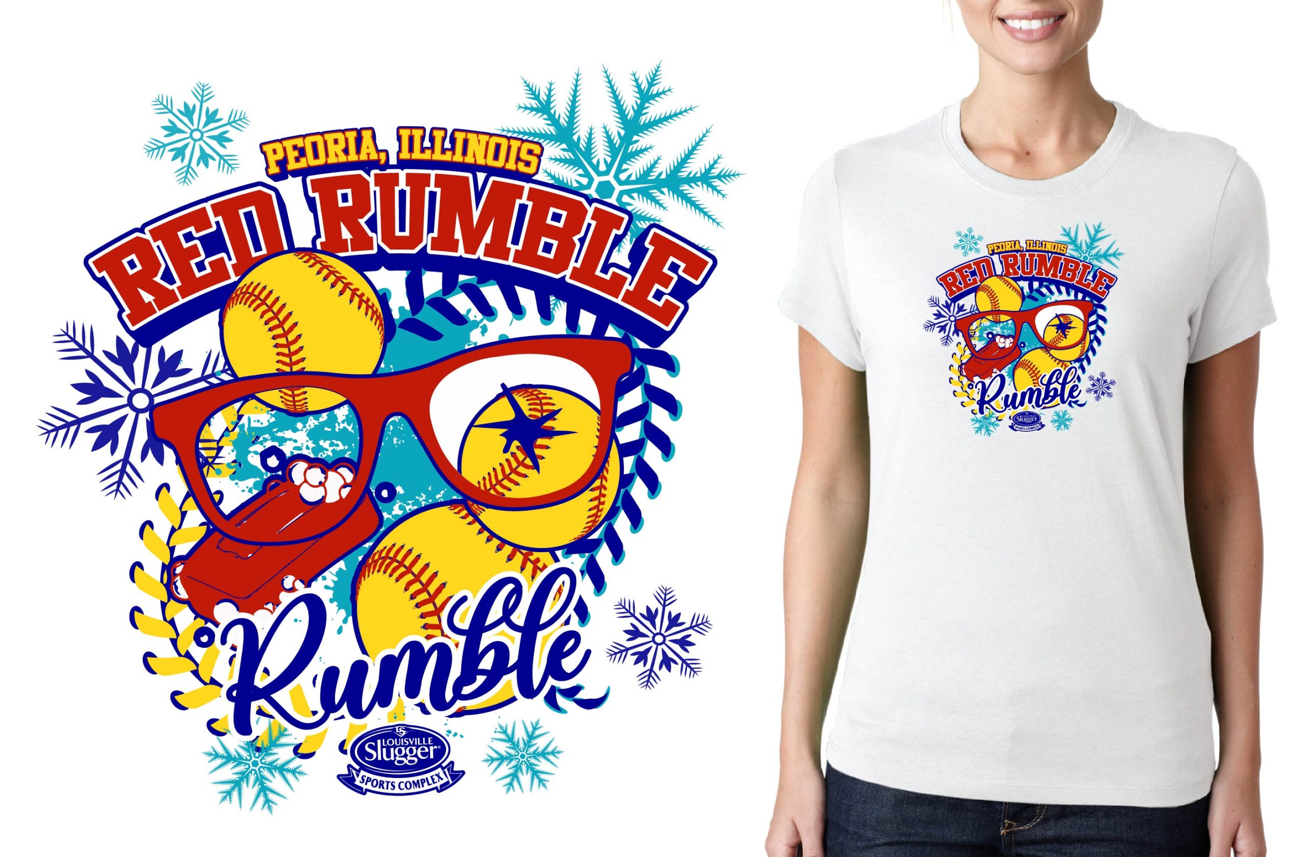
The Red Ryder Rumble is more than just a softball event; it’s a celebration of teamwork, perseverance, and athletic excellence. To capture this essence, we focused on the concept of rivalry and action, using imagery and symbolism tied to softball’s high-energy gameplay and the wild-west-inspired theme of the “Ryder” name.
Our vision included elements such as a bold softball flying through motion lines, paired with western-inspired accents to echo the Red Ryder theme. We sought to balance a classic sports feel with a rugged edge, ensuring the logo would strike a chord with players and spectators alike.
Design Process
Using Adobe Illustrator, we began with initial sketches, exploring a variety of layouts that incorporated action and movement. We experimented with the placement of the softball imagery and the text to ensure legibility across various formats, such as jerseys, banners, and digital promotions.
Color Palette
The chosen color palette combined fiery reds, vibrant yellows, and deep blacks, meant to evoke both the intensity of a western standoff and the excitement of the game. The boldness of these colors allows the logo to stand out while tying it to the event’s name.
Typography
For typography, we used a strong, athletic font style with a slight flair reminiscent of old-west signage for the “Red Ryder” text. Subtle texture effects were added to give the text a weathered yet modern appearance. This ensured the design would feel versatile and impactful across various materials.
Iconography and Finishing Touches
The softball itself became a focal point, featuring motion trails and subtle accents to symbolize speed and precision. Behind it, geometric shapes reminiscent of a setting sun were added to give the design a sense of depth and drama.
Importance of a Strong Logo in Event Branding
A strong logo is vital for any event, and the Red Ryder Rumble is no exception. It not only serves as a visual representation of the competition’s spirit but also fosters a sense of pride and identity among the players and fans. A memorable logo consistently elevates an event’s visibility, whether it’s used on merchandise, promotional flyers, or social media.
Our design for this year’s Red Ryder Rumble Softball Event delivers on these goals, helping create a shared connection for everyone involved. It merges creativity with functionality and serves as a striking emblem of the event’s excitement.
Final Thoughts
At MyEventArtist, we’re passionate about helping events, like the Red Ryder Rumble, stand out with unique and meaningful designs. Our team’s diverse capabilities ensure that every project reflects the heart and soul of the event. Whether it’s through layered vector designs, customizable live fonts, or completely bespoke artwork, we’re here to bring your vision to life.
Explore our services today:
- Print Ready Designs
- Adjustable Titles and Subtitles
- Adjustable Font Designs
- Custom Design Requests
- Adjustments for Purchased Designs
- Customize Print Ready Design
Let’s create something extraordinary for your next event!
#SoftballDesign, #EventLogo, #RedRyderRumble, #SportsBranding, #LogoCreation, #CreativeProcess
SoftballDesign, EventLogo, RedRyderRumble, SportsBranding, LogoCreation, CreativeProcess
Leave a Reply