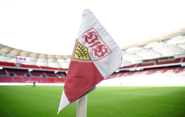
In the realm of sports, where every match is a battle and every win is celebrated, the logo stands as a beacon of a team’s spirit, strength, and prowess. It’s not just a design; it’s a statement. A well-crafted sports logo can stir emotions, rally fans, and even unnerve rivals. But how does one infuse such power into a logo? The answer lies in the art of symbolism.
The Deep Roots of Symbolism
From ancient civilizations to modern societies, symbols have been a medium to convey complex ideas succinctly. They transcend language barriers and resonate on an emotional level. In sports, a logo isn’t just a mark; it’s an emblem that carries the weight of its team’s history, aspirations, and values.
Animal Symbolism: A Testament to Nature’s Power
Nature is replete with powerful creatures, each symbolizing unique traits. Lions epitomize courage, dominance, and majesty. Eagles, soaring high, symbolize freedom, vision, and tenacity. By integrating such animals into sports logos, teams can channel their inherent qualities. The diverse designs at MyEventArtist beautifully capture the essence of these creatures, making them synonymous with the teams they represent.
Drawing from Cultural Wellsprings
Every culture is a treasure trove of symbols. From the Celtic knots representing eternity to the Maori tribal patterns symbolizing warrior status, there’s a wealth of inspiration to draw from. Incorporating these can give a sports logo a rich backstory and a connection to ancient traditions.
The Psychology of Colors
Colors aren’t just visual elements; they’re psychological triggers. Red can ignite passion and aggression, making it apt for a team that’s all about relentless pursuit. Blue, with its calming aura, can signify a team that’s strategic and composed. The vibrant palette at MyEventArtist is a testament to the power of color in logo design.
Modern Symbols: Breaking the Mold
While traditional symbols have their charm, there’s a shift towards abstract and modern symbols that allow for a wider interpretation. Geometric patterns, negative space, and minimalistic designs can convey dynamism, innovation, and forward-thinking, resonating with a younger, global audience.
The Nuances of Typography
The choice of font in a sports logo is as crucial as the symbols. Bold, angular fonts can convey aggression and dynamism, while sleek, curved fonts can exude elegance and fluidity. The art lies in choosing a type that aligns with the team’s spirit.
Consistency and Evolution
While imbibing symbolism is vital, it’s equally crucial to ensure that the logo remains consistent across years. Yet, as teams evolve, so should their logos. This evolution, while staying true to the original essence, keeps the brand relevant and relatable.
Conclusion
A sports logo is more than just a design; it’s the team’s heart and soul. By weaving in symbolism, teams can create logos that are not just visually appealing but emotionally resonant. With platforms like MyEventArtist, the journey from an idea to an iconic logo becomes an inspired journey.
Leave a Reply