Designing a logo for the Hits For The Cure 2023 Softball Event was a creative journey fueled by purpose and passion. Our goal at MyEventArtist was not only to showcase the competitive, fun spirit of softball but also to honor the deeper mission of the event—supporting an important cause through community connection, awareness, and determination.
Conceptualization and Inspiration
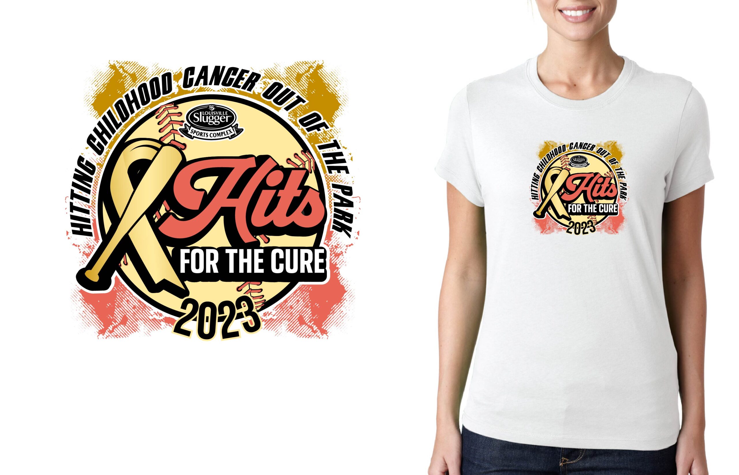
This event combines the thrilling nature of softball tournaments with a heartwarming mission to raise awareness and funds for a greater cause. That dual spirit of teamwork and philanthropy greatly influenced our design process. Early brainstorming sessions centered on integrating iconic softball imagery with elements tied to unity and hope.
The visual centerpiece of the logo became a brightly colored softball in motion, designed with dynamic curves to symbolize both action and determination. To further emphasize the mission, we embedded a prominent awareness ribbon into the design, flowing seamlessly around the softball’s curves. This ribbon not only represents awareness and support but also conveys a sense of togetherness—the essence of what Hits For The Cure stands for.
The Design Process
Our design process began with pencil sketches to explore the relationship between the softball and the awareness ribbon. These rough drafts paved the way for a polished logo idea that balanced movement, energy, and compassion. Using Adobe Illustrator as our primary design tool, we refined these sketches into sophisticated vector visuals.
Color played a critical role in bringing the logo to life. We selected a palette of vibrant yellows and greens contrasted with bold pink tones, symbolizing optimism, health, strength, and resilience. These colors were meant to inspire energy while keeping the cancer awareness motif at the forefront.
The typography was strategically chosen to balance clarity with creativity. The words “Hits For The Cure” were styled in a bold, modern font to ensure visibility for both digital and print mediums. A script-style font was incorporated into the word “Cure,” giving it a compassionate and hopeful feel that tied into the event’s mission.
Why a Strong Logo Matters for Hits For The Cure
A thoughtfully designed logo does more than identify an event—it unites people behind a common cause. For Hits For The Cure, the logo serves as a rallying emblem for players, donors, sponsors, and spectators alike. Whether it’s displayed on t-shirts, banners, social media posts, or promotional materials, this distinctive logo reinforces the event’s purpose while amplifying its sense of community and pride.
Moreover, an effective logo creates a lasting impression that extends far beyond the event. For supporters and softball enthusiasts, this design becomes a symbol of their commitment and contribution to something greater.
Conclusion
The Hits For The Cure 2023 logo reflects the values of the event while standing as an emblem of hope and teamwork. Through dynamic shapes, vibrant colors, and meaningful elements, we’ve crafted a design that resonates deeply with the event’s mission while standing out in the world of sports branding.
If you’re looking to elevate your event’s brand with a custom logo design, MyEventArtist is here to help. From layered vector designs to completely custom creations, our services give you the flexibility to create something truly unique. Visit our website to explore all we have to offer:
- Print Ready Designs
- Adjustable Titles and Subtitles
- Adjustable Font Designs
- Custom Design Requests
- Adjustments for Purchased Designs
- Customize Print Ready Design
Let’s craft something incredible together!
#SoftballAwareness, #EventLogoDesign, #CommunitySupport, #HitsForTheCure, #CharityEventDesign, #SportsBranding
softball awareness, charity event, logo design, sports branding, community connection, awareness ribbon
Leave a Reply